Cover trends: past, present, and future for my subgenre. Since I'm in the throes of writing high fantasy at the moment, I'll talk about those trends.The operative word here is trends.
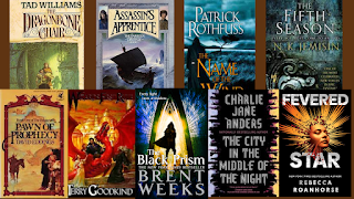
High fantasy leans towards using illustrated covers. In the US, we're big fans of characters and/or scenes being on the cover. In contrast, the UK covers tend to employ hyper-stylized fonts and symbols.
Side note: There's a very deep and fascinating rabbit hole of consumer research into which you can tumble about how cultural differences between the US and UK (and other nations) shaped media design and distribution through the early '00s (before streaming modified consumer behaviors). In short, US consumers like their fantasy detailed in design and well defined in storytelling, while UK consumers prefer more ambiguity and space to let their imaginations fill in frameworks. If you're a nerdlinger about consumer behavior like me, the rabbit hole for studying the US mainstream market's blossoming embrace of Asian-original entertainments isn't as deep as US-European, but interesting case-studies are cropping up. Unlike past investments, corporate money is chasing the niche fanbases that are growing exponentialy and globablly due to technology-enabled accessability and the diminishing digital borders.
In the way past (okay, the '80s) bright fantasy illustrations, often with the Chosen One on the cover, dominated. The '90s saw the rise of ambiguous settings over characters (a bay, a mountainside, an alleyway, etc.). In the '00s, the Hooded Man was everywhere along with the over/under split image covers. The '10s saw an influx of superfonts and symbols, adopting more of the UK market aesthetic. These designs are lingering into the early '20s because the pandemic's lockdowns impact on the modeling and photography/photo-illustration industry...and because using things instead of people on the cover tends to be cheaper. Keep in mind the books releasing this year from major publishers likely had their covers designed at peak pandemic. Smaller presses and indies, however, are far more nimble, and the trend there seems to be a rise of superfonts overlaying singular-character covers.
Now, because it's fantasy, illustrated character and scene covers never disappear. They're a staple of the genre. Plus, there's a dedicated superfan base who buy books based on the illustrator/artist more than the author.