Saturday, August 27, 2016

The Magic of A Good Book Cover

I was blessed by the cover goddesses on my first published book, Priestess of the Nile.  Carina Press asked the wonderful Frauke Spanuth of Croco Designs - who LOVES crocodiles - to create my cover and I still get compliments on the awesomeness.

It was so gorgeous and so evocative of the story and the time frame that I was nothing short of horrified when I got my second Carina cover, NOT by Frauke, and my Egyptian warrior was depicted as heavily bearded. Ancient Egyptian men were clean shaven, they're well known for that, other than the ritual beard worn by Pharaoh at times. Carina was very nice about fixing that aspect of the art (and I'm sure I was overreacting a bit, as a still pretty newly published author, but the Art Department was very patient.)

When I started self publishing, I went back to Frauke and have had her do all my subsequent covers for the ancient Egyptian series. I particularly love the art for Ghost of the Nile.

I self pubbed the science fiction romance novels from the beginning and have always worked with the amazing Fiona Jayde. Here's the first, Wreck of the Nebula Dream, which established the 'brand", as far as the font, and the stylistic elements of the hero and heroine, with a major scenic element from the plot under the title.

I was probably a pain to work with in the beginning. My daughter, also a published author, gave me a lot of helpful advice on which stock photos would and wouldn't work and what was pleasing and genre appropriate. I would gravitate to people and poses that now, looking back, I can see were totally wrong. I had a touching, if misplaced faith in the ability of the cover artist to manipulate stock photos. Um, no, stock photos are what they are. Someone as talented as Fiona can do some wizardy, amazing things but the basic photo has to be appropriate.

The way we work now is that I reach the point where I want my eye candy cover, usually when I'm partway through the first draft. I go spend a few hours searching all the possible categories on a stock photo site or two, and pull maybe eight guys I think might work, a woman or two who suggests my heroine to me, and two to  three scenic element examples. I go back and make myself be strict, removing the photos that won't work - pose not right, too smiley, not really the look of a Sectors Special Forces soldier - and then I send an e mail packed with stockphoto url's off to Fiona.

She gently sends back the few that are actually workable and genre appropriate, and I settle on one for the hero. Fiona tends to be much better than I am at picking the right woman for the final cover. I leave the scenic element up to her after I've sent my "these are kind of what I had in mind" samples. Sometimes she has to suggest alternative guys as well.

I can't share the rejected photos with you because we never actually buy them. We just look at them on the stockphoto site so I don't have the right to display them here. Sorry!

On my new book, Trapped on Talonque, I did find the heroine myself, lucking into a stock photo of a girl with the lavender-blue hair described in the book AND elaborately braided, which my heroine Bitha's hair is at one point. Wow! When you're doing stock photos you learn early on that you're probably going to see the same models and poses on a lot of covers and you're not going to be able to truly portray your characters exactly as they are in the book. You can only suggest the mood and emotion as you entice the prospective reader with your thumbnail.

Covers are critically important - you really need a high quality cover to stand out to the reader among all  the choices they have available these days. It should be clear what genre you're offering and not look like you made it yourself in one hour of photoshopping. Some authors do have amazing graphic skills and more power to them, but sadly, a number of the indie covers I see are lacking. I do a weekly roundup of new releases in scifi and fantasy romance for my personal blog and seeing all the covers in one place together, you really can tell who is a DIY person that probably should have hired a cover artist. (Tip: go look at the top 20 Amazon best sellers in whatever genre you're writing, and see how those covers look, in terms of stylistic elements, font, etc.)

Some day I'd love to be successful enough to have custom cover photo shoots, especially for the Egyptian novels, but until then I'm very grateful for Fiona and Frauke, and creative stockphoto sites.

Trapped on Talonque, the story:

Will an alien sleeping beauty awaken to save him, or destroy everyone around her?
When a Sectors Special Forces soldier and his team crash land on an alien planet, they’re taken captive and given a challenge–win at the violent ball game of sapiche and live. Lose, and they die, sending a mysterious, alien beauty to an even uglier fate. To survive, these soldiers must win the game and find a way to free the dangerous prisoner from her locked chamber.
Nate Reilly and his team are in deep trouble. Prisoners on a backward alien planet, they’re brought before an alien ‘goddess’, sleeping in her high tech seclusion. Nate is astonished when she awakes and establishes a psychic link with him. But her news is not good–he and his men must win a brutal challenge set by their captors, or they will die. She’ll give her aid, but in the end their courage and strength must win the contest.
Bithia sleeps in her chamber, as she has for thousands of years, since her own people unaccountably left her there. Viewed as a goddess by her captors, she must hide her ancient secrets to survive. But only the bravest of men may free her. Can she use her psychic powers to keep Nate and his men alive long enough to help her escape, or will her only hope of freedom die with them?


Friday, August 26, 2016

Cover Lottery

File covers under: You win some, you lose some. Sometimes all on the same cover(s). Book covers have a lot of jobs. Entice a reader to pick the book out of all the books on the shelves in order to read the back cover blurb. Convey what kind of read to expect - genre, tone, what have you. And hopefully, if you're really lucky, the cover will get the hero or heroines hair color right. Ish.

Wins on my first two covers: Really pretty. Amazing artwork. The heroines are mostly right. Ari's book (yellow one left) makes her far too put together for her particular circumstance, but oh well. Jayleia's cover (green below) gets her right.

The losses on these covers: Neither one says SFR. They both, to my eye, convey urban fantasy, instead. Compounding that problem? They were shelved in romance. Also, that background scene for Ari? Doesn't exist. No where in the books. Jay's background? Well. Maybe. There is a temple on her home world that gets attacked and she gets to be all bad ass about. So okay.

These covers came from a traditional house and when they were presented to me, there was very little room for alterations or changes.


The next two covers were also from a traditional house, but were for their E-book only imprint. Both were for urban fantasy novels, which I think they convey reasonably well.


I think you get UF from this cover. And maybe you get that the heroine isn't exactly a kick ass supernatural. She has skills, yes, but swinging swords or staking vamps might not be among them. The piece missing for me is a hint of magic - which really defines Isa's books. I do love that she's more than half dressed. But without the hint of something mystical, this could also pass as a cover for a cozy mystery. Which makes it not as cool as it could be. The only other issue is that this cover isn't all that great at conveying the tone of the story - the fact that there's some torture and overall angst. The problem is that ebook covers have to do all the work that print covers do - but they have to do it in thumbnail. That shit's HARD.
The second book in the series did a better job, I think.

In this cover, I got the hint of magic and with the background, I think you get a taste of this story not being all sunshine and roses. Maybe. So. Ebook covers - but ebook covers still presented by a traditional house with their own agendas and ideas about what changes might be made when and where. Which is to say - not many.

The really interesting cover, for me, is the most current one. It's for a light paranormal romance. The story was a complete departure for me. There are no dead bodies. Well. None that die on screen, anyway. It was my first venture into self publishing. Therefore the pressure I put on getting the cover right was enormous. I had several ideas for how the cover could look. In the end, I won a Twitter contest for a free cover from the awesome Danielle Fine. I told her my cover ideas.

She shot me right down. And explained WHY she'd nixed my cover. Her experience with romances novels and with paranormal in particular told us that paranormal readers expect the couple on the cover. Well okay. I was so relieved to have some guidance, I instantly sent over all of the particulars about Fiona and Darsorin. Danielle mocked up several different covers. We sat with them, hemming and hawing. I picked one I liked, but asked for a few changes in the hero. Discontent with the covers, Danielle went back to the drawing board and sent me a cover that made me gasp when I saw it because it was 100% right.

The characters are dead on. The single issue is that the flames surrounding them (while entirely appropriate to a theme that runs through the book) suggests this is a hot read. And it ain't. See. While Darsorin is an incubus and feeds on sexual energy, Fiona is asexual. So sure fire happens in the book...but...you know. Anyway. I hope to heaven it's not misleading. Or if it is, the story is enjoyable enough as is. Because, boy, do I love this cover.

Given my druthers which cover process do I prefer? Oh, this last one. Hands down. Getting to strive for a cover that does the matches the story is a huge win. Even if it means brainstorming several times before you finally find the right fit - that was something that simply wasn't an option with any of the traditionally published titles. That isn't to say I wouldn't work with a house again. I would. For the right book and circumstances.  But there's a lot to be said for having control over the face your stories present to the world.

Thursday, August 25, 2016

The Covers of Maradaine

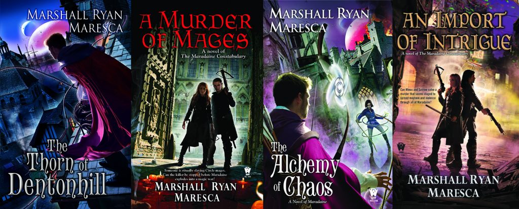
I feel like I've been very fortunate with the covers of my books.  Paul Young has been the cover artist for all four books so far, and I'm given to understand that Sheila's intentions are to keep using him for my books, which suits me just fine.  Because Paul gets the look and feel of Maradaine, and what I want the covers to evoke.  He gives a cover that clearly says, "Hey, this is what kind of book you're getting." And it's spot on.  And he's also receptive to my thoughts and concerns.
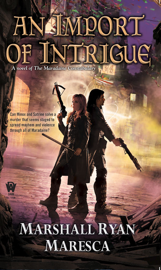
Collage 2Case in point: the Import of Intrigue cover, which is probably my favorite to date.  There were plenty of tweaks from the initial image I was shown to the final version.  We went through, for example, variants of Satrine's handstick until we had one that I was happy with.  Paul also integrated the Tsouljan text I created into the signage. I love the look and feel of the whole thing.
I've seen an initial concept for the Holver Alley Crew cover, and I'm already very happy.  I can't wait to see the final version, and be able to share that as well.  Since that book will be coming out in March 2017, that won't be the far away.  But for now, we'll just enjoy the Import cover.  
Maresca - An Import of Intrique
An Import of Intrigue releases on November 1st.

Wednesday, August 24, 2016

Birth of a Book Cover

Recently, I got to preview the cover for my book coming in May 2017…it is GORGEOUS!!! But I can’t reveal it yet…so I’ll talk about another cover. (Tease, I know...)

In my experience, Editors generally ask an author what they anticipate the cover would look like. It is largely, I suspect, a courtesy. I also suspect that many authors site a certain scene from the story, and comment on the hero/ine’s ethnicity, hair color, age, etc. and any ‘props’ the character should have in the image.

I also suspect that a minority of authors have actually worked as graphic artists or in other directly creative positions. 

Because I am one of those few, when my editor asked me specifically about ARCANE CIRCLE, I went to the internet and searched for people with awesome ink. ARCANE CIRCLE was largely about ‘unlocking’ the power bound in Johnny’s many tattoos, so I wanted to represent that on the cover. I found a photo of a woman whose back had a fabulous dragon and foo-dog image and I copied it to my computer. Then I searched for images of a woman with one arm raised. Scored another win in a picture of some young lady with her arm up, elbow bent, and forearm lazily draped across the top of her head. After saving it also, I opened up Photoshop.

I added a wand in the female’s hand, made the tip glowy and ‘magical.’ Then to I took the tattoo image, erased everything but the actual dragon and foo-dog, then adjusted the opacity until I could see through them just enough. This all took me less than an hour to search, find and complete my ‘mock up.’ It was rough, to say the least, but let me reiterate…it was a ”MOCK UP.” I proudly sent it off to the editor.

Her response was something along the lines of, “Do you seriously expect me to show this to the senior editor, coordinators, and/or sales staff?”

As this was the fourth book in the series and I was pretty confident that I’d have the same artist (Don Sipley) for this as I had for the previous ones, my reply was basically: “No, I expect you tell them whatever they need to hear…then send this image on the sly to the cover artist. He’ll know what to do.”


Indeed he did. WHATS MORE, the building in the background has the same overhang feature as a prominent building in the story, so the artist either got super lucky, or (more likely) he did a little research. (Respect!!!) And in turn, I modified one of the scenes to reflect Persephone's outfit as he portrayed it. This one of my favorite covers...the colors, the moonlight... What do you think?


Tuesday, August 23, 2016

A Cover Story

The absolutely wonderful Glendon at Streetlight Graphics did the covers for my Fire Born series. He's designed two already and I hope he'll continue for the remaining three. Not only did he do the covers, he did the map and the formatting. In essence, I handed him my Word doc and he gave me back a completed book in multiple ebook and print file formats (optimized by vendor).

Going into the Great Cover Artist Hunt, I knew I wanted an illustrated cover. Matter of fact, I knew exactly what I wanted on the cover--her hand holding the snowglobe nation with just a hint of her unusual face. I also know that being that particular about a vision can often lead to disappointment.

It didn't.

I love working with Glendon. I found his company, Streetlight Graphics, through a Google search. Yes, I reviewed hundreds of potential artists' sites before contacting Streetlight Graphics. It's a case of being 85% sold purely based on their website. Their site isn't particularly whizbang. It's actually quite a simple site while being very informative, which told me they understood the value of restraint in design and respected the self-publishing author. Once I contacted them, Glendon closed the deal with his personable professionalism.

Glendon sent me a worksheet to complete that asked for everything from title, tagline, back copy, comparables, likes and dislikes, etc. From there, it was a matter of approving initial concept sketches (which he nailed out of the gate, btw), then minor tweaks. I had no changes to the spine and back cover design for the print version.

Same story for the second cover, which I'll reveal...after I write the book. (DOH!)

Yeah, if you need a one-stop-shop that does amazing work, I highly recommend Streetlight Graphics.


Monday, August 22, 2016

How My Covers Came To Be

Oh, I could tell you stories.

I will, too,

The first novel of mine ever to see print was a novel called HOUSE OF SECRETS. It was co-written with another author and we worked on  HARD deadline. It was a work for hire, and we were supposed to have a card made for the card game Vampire: The Eternal Struggle based on the cover and the story. We worked hard, we gave what I thought was a pretty darned decent story that involved as many actions and characters from the card game as we could reasonably fit, and we delivered on time.

And then they gave us, hands down, the worst piece of shit cover I had ever seen.

It had NOTHING to do with the book and made for such a lousy card that they decided not to include it in the card game.


The second time around I was working on a different work for hire book for the same company, this one had been licensed out to Random House, I believe. Once again, there would be a card for the gamer and I was ecstatic. They asked for notes. I gave them EXACTLY what i wanted on the cover. I gave full descriptions of the characters and how  they were dressed, how to place them in the picture, what the background should be. A climactic scene from the novel that involved two gunslingers, one horribly scarred, one who looked like a corpse, a glass building next to them in which, if the artist was feeling adventurous, he might show the tornado that was coming for them reflected in the glass.

This one was called Werewolf: Hellstorm. I had a blast writing it.

And then I saw the cover.

NOTHING. Not a damned bit of the information I provided, was included. Not one iota.

What I got instead was a hot mess that did everything it could to rip off Mike Mignola, a far better artist. The artist in question who worked on the cove actually told me the cover was too ambitious for him.


And from there, the list goes on. I've had a LOT of covers over the years. Some I loved, some I hated. The latest ones? The ones I have loved the most? They all have to following in common: A smart art director, a fabulous artist and the ability to actually portray characters from the books as they are described. 

The artist in question is Alejandro Colucci. He is amazing. 

These are the covers he did for me. 

In every case, he was given a few paragraphs of description about the character in question, usually pulled directly from the manuscript, and suggestions were offered as to what sort of background would be best. 

And then...magic.


Not surprisingly, the sales of the latest four books have been substantially better than those first two. I blame the covers.

Well, and maybe the writing got better too, but I can't really judge that. 

Okay, back to work on the edits for TIDES OF WAR: Book one, THE LAST SACRIFICE.

That, too, is a book of mine coming out from Angry Robot Books.  They gave me those gorgeous covers. We've discussed the new series and what the covers should look like. I personally can;t wait to see them.


Sunday, August 21, 2016

Crafting the Cover

A timely topic for me this week as we just released book two in my Sorcerous Moons series, ORIA'S GAMBIT, which was a bit later going up than originally planned because we were tweaking the cover.

Okay - because I asked for a huge change after I saw the final cover. Here's the story.

See, I'm still new at designing my own covers. With my traditionally published books, like The Twelve Kingdoms and The Uncharted Realms, the covers are presented to me as a fait accompli. I get a little input at the beginning, but that's it. Because I'm publishing the Sorcerous Moons books on my own, I work with my cover artist, the amazingly talented and infinitely patient Louisa Gallie to come up with just the right cover.

We started with me sending Louisa the draft of the book. She read it (one of the perks for her, she claims) and sent me some initial sketch ideas.


I liked all of them, but none felt exactly right. This is the hard part for me. I have a really hard time envisioning what I think it should look like and communicating that.I kept coming back to look at them over several days and ended up saying:

I think none of these really sing to me, though I totally see what you’re going for. I like the action of #1, though not the exact pose. LOVE Chuffta flying and flaming and I like that background. I also like the background of #2. What about this? What about a pose similar to #2, but in her rooftop garden, with them at kind of a tense standoff and Chuffta flying and flaming above? And maybe she should be in her mask? It doesn’t have to be a scene directly out of the story. Though another thought could be something from the testing scene at the end. I’m just throwing stuff out here....

Louisa replied:

So, something like the pose of 2 but with the tilted, actiony angle of 1, Chuffta, and the background from 3? Trying to get the image straight in my head.
I can put her in her mask, it would work for a tenser scene if we can't see her expression. They're described as smooth and featureless but I seem to remember cheekbones mentioned. So would her mask be shaped with the contours of a face (cheekbones , nose, browbone) but without eyes or lips?


We went back and forth a bit and she worked on it from there and next sent me these sketches:


I still wasn't totally on board, though I wasn't sure why. I was finding that I couldn't get closer to knowing what I wanted by seeing what I *didn't* want. Louisa sent me a new sketch with this caveat:

My clients are never supposed to see this stage of a sketch, but as we're exploring...


I could turn him like this? I did increase the tilted view simply because two people standing side by side, facing the same way, can get boring quite quickly, and it adds some drama. I think maybe I'd want to angle him more behind her just to add some more depth and so they still look far apart (although technically it creates less distance between them on the canvas, which helps with a vertical aspect ratio.

Hear that crazy artist talk? I was all, sure, what you said. Though I pointed out that he should probably be holding the axe in his right hand.

Turns out that's easy to flip! She sent me three more sketches, along with this explanation:

Ok, I've sketched the amended poses out properly, and there's a flipped version so the axe is in Lonen's right hand. I think it maybe looks a bit better the original way, but it's really not much difference either way. So your call!
The only small difference between the two versions here is whether their hands have actual canvas space between them. They're not actually touching in either but if they're just barely not-touching, then technically their hands should overlap because of where Lonen is standing. It does also let me bring them closer together and make the figures a little....but looking at them now, there's no real huge difference. It's a tiny detail and I'd be ok with either.


I was liking it and we went with the flipped version. She sent the next sketch to let me know she was making progress and would be refining details.


I gave her a few thoughts and she sent the almost finals.


At this point I discovered I'd missed something along the way. Enough time had lapsed that I'd forgotten I'd asked for her to wear the mask! I'd been thinking her face just wasn't done and now... well, the mask looked creepy. Also I remembered that Lonen has a scar on his face! I said:


So, what I said about the scar: They locked eyes and wills. His, densely fringed with black lashes, were a dark gray, like the granite their sister-city to the north, Arvda, sent in trade. Surprisingly lovely, they would have made him look feminine but for the angry line of a recent scar that dragged from his forehead, skipped his eye, and continued down his cheek. Nearly missed losing that eye to whatever had sliced at him, something thin and sharp by the look of it.
 Lonen lay on his back, face relaxed so the scar that cut from his forehead, over one eye and down his cheek didn’t pull to the side as it did when he was awake. More scars criss-crossed his chest and concave belly—funny that her sgath didn’t show them.

As for the rest – looking good! Love how the title/fonts look.

Her left, upraised hand looks funky with the way her fingers are spread – can we bring them together?

Also, I think the mask needs to be smoothed. I’d forgotten that we’d talked about her wearing the mask and I was all wtf is wrong with her face?? Lol. So *I* didn’t see that it was a mask, so I think we need to make it more mask-y. A blank oval might work better to make this more obvious?

Can we add a moon to the sky? Either is fine. Maybe too hard with the text and Chuffta, too.
 And it there’s any way to make her hair look more copper (maybe there isn’t) that would be great.


At least she didn't kill me. That was still to come. She said:  


Ok. I really tried with the mask but a plain blank mask, or even one with eyes and no other features, looked totally bizzare. At a normal distance it looked like she had no face at all (like we'd forgotten to add it) and even when zoomed it it just looked weird and at best, sci-fi.  So, I did my best to smooth out the features and make it more metallic so it looks more mask like. What do you think?
Moon did conflict with the text and Chuffta so it's partially behind a cloud, but still there!
I adjusted her hand and gave her hair more coppery metallic tones.
 Unless theres' anything really critical (or really really tiny) this is all the time I have more changes, as I'm on a train after work tomorrow. I'll have a little time at lunch or first thing before work if there's anything very quick.
I'll upload the high res files now, crossing my fingers they're ok, and send you the links! 

And here's that cover: 

And... people - Louisa did an amazing job! But I *hated* the mask. I showed it to a few people and they all used variations of the word "offputting." We were at the drop-dead mark for getting the book released on time, Louisa had killed herself to get this finished by the deadline and was going away for the weekend. 
This wasn't tiny.
But I also didn't want to put it out there with an offputting cover. 
I emailed Louisa with the bad news and she exercised that infinite patience. Five days later, Oria had a face. 
I'm really pleased!
And now we're starting on the cover for book three, THE TIDES OF BÁRA. I'm sure Louisa is breathing a big sigh of relief, as I just approved the very first sketch.


About the Book

A Play For Power
Princess Oria has one chance to keep her word and stop her brother’s reign of terror: She must become queen. All she has to do is marry first. And marry Lonen, the barbarian king who defeated her city bare weeks ago, who can never join her in a marriage of minds, who can never even touch her—no matter how badly she wants him to.
A Fragile Bond
To rule is to suffer, but Lonen never thought his marriage would become a torment. Still, he’s a resourceful man. He can play the brute conqueror for Oria’s faceless officials and bide his time with his wife. And as he coaxes secrets from Oria, he may yet change their fate…
An Impossible Demand
With deception layering on deception, Lonen and Oria must claim the throne and brazen out the doubters. Failure means death— for them and their people.
But success might mean an alliance powerful beyond imagining…

Saturday, August 20, 2016

The Character I'd Love To Write

Confession time: I really don't want to write any characters but my own. Yes, I enjoy the heck out of other people's books and there are characters I LOVE...but I don't want my version of their world and continuing story - I want the actual, original author's plot. And not as continued or extended by anyone else...

When I was a kid and there was a world I longed to be a part of - Trixie Belden maybe, or Robin Hood or Tom Corbett Space Cadet - I wrote myself into their worlds (fan fiction before I even knew such a thing existed!) as a character of my own.

I've thought and thought about this post all week, trying to come up with somebody's existing character I could honestly say I wanted to write stories for and the best I could do was Eomer from Lord of the Rings. I wanted a LOT more of him (but how much of that had to do with Karl Urban I'll leave up to you...)

Now I really liked Marcella's idea yesterday, of taking someone real and wanting to tell their story...but as soon as I do that, my brain starts adding science fiction and fantasy elements and that's kind of how I started writing my Gods of Egypt series in the first place. I don't want to be be tied to reality or anyone's actual life.

I would enjoy being invited to write my own story with my own characters in certain authors' worlds, as I've mentioned (probably too often!) in the past, but the blog topic for the week wasn't "what other worlds do you want to write in"...

As far as characters in my own books, I've been wanting to get to the story of Khevan the D'nvannae Brother and Twilka the Socialite, supporting characters in Wreck of the Nebula Dream, and What Happened Next. I even had the plot pretty much figured out but I just never had the motivation to sit down and write it. Last week I finally figured out that if I wasn't writing, it wasn't the right story so I challenged myself to take a totally new tack and - there the adventure was! I've had readers asking me for more about Khevan and Twilka since Wreck came out in 2012, so I'm hoping people will enjoy it. Nick and Mara do have a role to play in the action.  The goal is to publish the book before the end of 2016.

I also want to tell a new story for Mitch, the sergeant in from Escape From Zulaire  but I'm still listening for the Muse to give me the right challenge for him to tackle.

And Edekh, the Chief Scribe in the palace of my Pharaoh in ancient Egypt, really needs his own book but again, waiting for the Muse to deliver more details.

What character in a book have you always wanted more of?