What does my writing space look like? And how 'bout my TBR pile?
~hastily vacuums~
~forgets to dust~
Tuesday, March 22, 2022
KAK's Den
 Fantasy Author.
The Immortal Spy Series & LARCOUT now available in eBook and Paperback.
Subscribe to my newsletter to be notified when I release a new book.
Sunday, March 20, 2022
The Writer's Altar & Endless TBR
Writing Spaces...
My Current TBR...
- Finish reading Empire of the Vampire by Jay Kristoff
- Finish A Court of Wings and Ruin by Sarah J. Maas
- Malice by John Gwynne
- Boyfriend Material by Alexis Hall
- Hook, Line, and Sinker by Tessa Bailey
- Daughter of the Moon Goddess by Sue Lyn Tan
- A River Enchanted by Rebecca Ross
- The Great Witch of Brittany by Louisa Morgan
- A Marvellous Light by Freya Marske
- Little Thieves by Margaret Owen
- The Love Hypothesis by Ali Hazelwood
- The Island of Missing Trees by Elif Shafak
- In my Dreams I Hold a Knife by Ashley Winstead
- The Atlas Six by Olivia Blake
 CHARISSA WEAKS is an award-winning author of romantic and historical fantasy. She crafts stories with fantasy, magic, time travel, romance, and history, and the occasional apocalyptic quest. You can find Charissa on Instagram if you'd like to follow her writing journey!
Thursday, March 17, 2022
Anita Mumm @ Mumm's the Word Editing
My favorite book-adjacent creative is hands down Anita Mumm at Mumm’s the Word Editing.
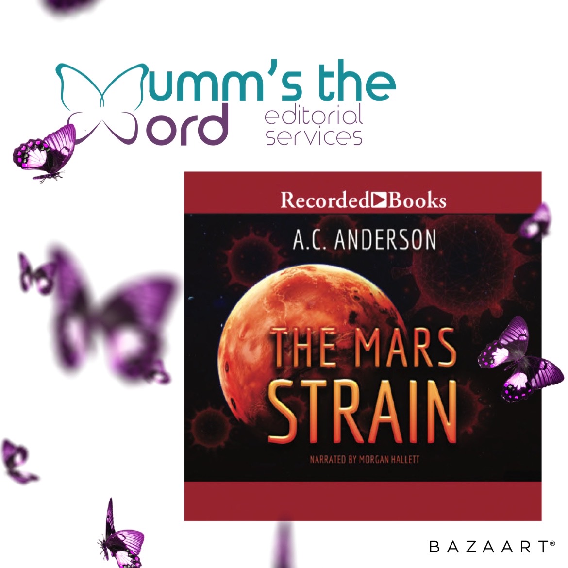
Anita was my editor for The Mars Strain before it became the amazing audiobook it is today. Which of course means any and all typos or mistakes are MINE, because I was the last eyes on my manuscript before it was submitted to Recorded Books.
If you’re looking for an editor to do deep edits, line edits, help with a query letter, or agent search consulting—check out Anita. I’ve mentioned this before, but the get to know you form she has you fill out has excellent questions and she really takes the time to understand your expectations before she will begin.
Did I mention she has a great brain for finding plot holes and a knack for kickstarting your brain into storm mode? And on top of all of those skills, she’s a lovely person.
Curious if she works with your genre? Here’s her list:
COMMERCIAL FICTION
LITERARY FICTION
WOMEN'S FICTION
ROMANCE
SCI-FI / FANTASY
MEMOIR
NONFICTION
YOUNG ADULT
MIDDLE GRADE
SHORT STORIES & ESSAYS
Find her at her website anitamumm.com
 I'm a reader, writer, blogger, musher who pens Sci-Fi as A.C. Anderson and Fantasy as Alexia Chantel. Chronic Disease can't hold me down.
Wednesday, March 16, 2022
Shoutout to Ravven, My Brilliant Cover Artist!
I swear, sometimes I think I wouldn't have an indie career without her!
Ravven is just a hugely talented cover artist with the phenomenal ability to simultaneously nail genre, find exactly the image that's in my mind, and create a brilliant work of art.
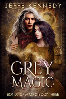
These are the two most recent covers she's done for me, and they're just fabulous. All the love to Ravven!
 Jeffe Kennedy is a multi-award-winning and best-selling author of romantic fantasy. She is the current President of the Science Fiction and Fantasy Writers of America (SFWA) and is a member of Novelists, Inc. (NINC). She is best known for her RITA® Award-winning novel, The Pages of the Mind, the recent trilogy, The Forgotten Empires, and the wildly popular, Dark Wizard. Jeffe lives in Santa Fe, New Mexico. She is represented by Sarah Younger of Nancy Yost Literary Agency.
Monday, March 14, 2022
Dan Brereton
So the idea for this week is to point out someone you admire in the art field and for me, that's Dan Brereton. Dan is a comic book illustrator, writer, and creator. He's worked for Marvel Comics and DC Comics as well as on his own stuff. He's is also a writer with serious chops, and the creator owner of THE NOCTURNALS, which is, hands down, one of the best independent comics out there. In fact, if you go to http://www.nocturnals.com, you will find a page of gorgeous illustrations to make my point.
Dan is also one of the artists who has been kind enough to work with me on covers for a few books of mine, like my short story collection THIS IS HALLOWEEN, and my collection SLICES, and the anthology I put out last October, OCTOBER NIGHTS, and my novel HARVEST MOON, and were working on a few other projects together, because, well, it's fun.
He is a talent, and a force to be reckoned with.
\If you have a chance you should check out his work. In addition to being a major talent and illustrator, he's one of the good guys. I'll even go crazy here and point out that he's one of my favorite people.
 I write fiction, a little of everything and a lot of horror. I've written novels, comic books, roleplaying game supplements, short stories, novellas and oodles of essays on whatever strikes my fancy. That might change depending on my mood and the publishing industry. Things are getting stranger and stranger in the wonderful world of publishing and that means I get to have fun sorting through the chaos (with all the other writer-types). I have a website. This isn't it. This is where you can likely expect me to talk about upcoming projects and occasionally expect a rant or two. Not too many rants. Those take a lot of energy. In addition to writing I work as a barista, because I still haven't decided to quit my day job. Opinions are always welcome.
Friday, March 11, 2022
Covering All That
Book covers are as much art as they are science and I mean that beyond the images. It's an art I'm not that good at. For that reason, I engage people who know more about book covers than I do - particularly people who know what questions to ask to elicit the most helpful (some might say most marketable) aspects of the story. Jeffe mentioned that the point of the cover is to catch the eye and to convey genre as quickly and completely as possible. If you can work story images into whatever ends up on that cover? Bonus. But more than once I've had to have a cover artist talk me down from the tree where I insist that some image from the plot needs to go on the cover. I never insist on having my way on covers - I hire professionals and then I listen to them. It's their livelihood. They know better than i what the trends are - but honestly, chasing trends is a fool's mission - the real issue is that the cover artists I hire have the experience to understand what a reader expects to see in a cover for a science fiction romance novel. Or an urban fantasy novel.
When I finally finish the SFR series, I'll have an opportunity to cover the books. I won't bother with trends. I will do my darnedest to make sure the covers for the two new books look as much like the previous three covers as possible. My goal will be to keep the branding visually similar. I want people to be able to look these books up on whichever online story they prefer and know just by looking that these stories belong together.
If I had the mental bandwidth to put a new cover on the incubus book, Damned if He Does, I'd work hard to get rid of ambiguous symbolism on the cover. Right now, the existing cover does a fine job of conveying that the story is a romance. But the cover includes all those flames. Lots of them. There's a plot reason for that - the incubus is in thrall to Satan and Hell. Unfortunately, in a romance cover, flames can also mean that the story is hot - erotic. In the case of this book, it was supposed to convey those fires of Hell. You can see how that image on the cover could be confusing. I'm concerned that readers might pick it up thinking it's a sexy read when it isn't. The heroine is Ace. The smexy just isn't as hot and heavy as those darned flames might mistakenly convey. In a perfect world, I'd have the bandwidth to update the cover. I just don't at the moment.
Book covers can be a great asset to a book and across the publishing world, you'll find all kinds of check lists and points to consider as you work on building a visual package to represent your story. They're worth glancing at. It's always worth glancing at what other authors in your genre are doing with covers as you think about yours. But it pays to remember that the cover has one job - get someone to crack open your story. That's it. And yes. It's a lot to ask of a static image. Buy maybe that awareness can help you take a step back. Sure. We all want our covers to be perfect. We worked so hard on the story, we want it dressed to the nines, dang it. Just consider what kind of audience you're going to attract if you dress your book like Wednesday Adams versus dressing it like a Kardashian or like Annie Oakley or like Madam Curie. Very different looks. Very different moods. Very different audiences. It's one of the tricks a cover artist taught me. Pan out a little. Consider the voice of the story. Then match the feel of the cover to that voice if you can.
That's the piece I'll add to Jeffe's advice of focusing on eye catching and genre. Figure out the voice of the story and lean into it in the cover.
Wednesday, March 9, 2022
When It's Time to Put New Covers on a Series
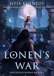
These were among the first book covers I ever commissioned and I particularly adore the cover for book one, LONEN'S WAR. It does come straight from a scene in the book - a pivotal scene that was, in part, the genesis image for the story - and the artist (Louisa Gallie) exactly nailed what I had in mind.
I will always be grateful for Louisa's gorgeous art and I will always love this cover.
But, recently, people have been pointing out that these covers no longer convey what kind of story these books tell. The fantasy romance genre has moved on. If I want to tell readers that this IS the kind of thing they're looking for, then I should consider updating to match current trends.
Behold: The new cover for LONEN'S WAR!
I contracted with BZN Studio Designs to design new covers for all six books. Right now the series isn't available, but once I have all six covers, I'll re-launch the series with some fanfare. I'm super excited to see how they do with the new covers. I've heard some people (including my own assistant!) say scathingly that these look like all the other covers out there in this subgenre, and there's truth to that.
AND THAT'S THE POINT.
The content is what makes the stories unique. The covers are doing the job they're supposed to do. Caught your eye, did it? I hope so! And I'm hoping you also know exactly what kind of story you'll get.
 Jeffe Kennedy is a multi-award-winning and best-selling author of romantic fantasy. She is the current President of the Science Fiction and Fantasy Writers of America (SFWA) and is a member of Novelists, Inc. (NINC). She is best known for her RITA® Award-winning novel, The Pages of the Mind, the recent trilogy, The Forgotten Empires, and the wildly popular, Dark Wizard. Jeffe lives in Santa Fe, New Mexico. She is represented by Sarah Younger of Nancy Yost Literary Agency.
Tuesday, March 8, 2022
Fantasy Covers: From Character Illustrations to Superfonts & Thingamajigs
Cover trends: past, present, and future for my subgenre. Since I'm in the throes of writing high fantasy at the moment, I'll talk about those trends.The operative word here is trends.
High fantasy leans towards using illustrated covers. In the US, we're big fans of characters and/or scenes being on the cover. In contrast, the UK covers tend to employ hyper-stylized fonts and symbols.
Side note: There's a very deep and fascinating rabbit hole of consumer research into which you can tumble about how cultural differences between the US and UK (and other nations) shaped media design and distribution through the early '00s (before streaming modified consumer behaviors). In short, US consumers like their fantasy detailed in design and well defined in storytelling, while UK consumers prefer more ambiguity and space to let their imaginations fill in frameworks. If you're a nerdlinger about consumer behavior like me, the rabbit hole for studying the US mainstream market's blossoming embrace of Asian-original entertainments isn't as deep as US-European, but interesting case-studies are cropping up. Unlike past investments, corporate money is chasing the niche fanbases that are growing exponentialy and globablly due to technology-enabled accessability and the diminishing digital borders.
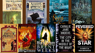
In the way past (okay, the '80s) bright fantasy illustrations, often with the Chosen One on the cover, dominated. The '90s saw the rise of ambiguous settings over characters (a bay, a mountainside, an alleyway, etc.). In the '00s, the Hooded Man was everywhere along with the over/under split image covers. The '10s saw an influx of superfonts and symbols, adopting more of the UK market aesthetic. These designs are lingering into the early '20s because the pandemic's lockdowns impact on the modeling and photography/photo-illustration industry...and because using things instead of people on the cover tends to be cheaper. Keep in mind the books releasing this year from major publishers likely had their covers designed at peak pandemic. Smaller presses and indies, however, are far more nimble, and the trend there seems to be a rise of superfonts overlaying singular-character covers.
Now, because it's fantasy, illustrated character and scene covers never disappear. They're a staple of the genre. Plus, there's a dedicated superfan base who buy books based on the illustrator/artist more than the author.
 Fantasy Author.
The Immortal Spy Series & LARCOUT now available in eBook and Paperback.
Subscribe to my newsletter to be notified when I release a new book.


