Showing posts with label Cover Art. Show all posts

Sunday, October 29, 2023

Cover Tough Love


 Our topic at the SFF Seven this week is "Judging a book by its cover: cover trends and what you look for as an author or a reader."

There have been excellent posts this week exploring why we buy covers, what we look for and love in covers, even being misled by covers. What I'm going to talk about is what a cover ISN'T for an author. And yes, this is something that's hard to hear. Stop now if you're not ready for a little tough love.

What a cover isn't: It is not an expression of the author's creativity.

I say this because I've heard more than one - usually a newer author - say that they want it to be. I recall one time that my aunt asked me to talk to a friend of hers who was a first-time author working with a small press to publish her memoir. She was super unhappy with the cover they developed and fighting with them about it. I think she fully expected me to give her ammunition in that fight. Instead, I gave her this tough love talk:

The cover of the book is not an expression of your creativity. The BOOK - what's inside the front and back cover - is the expression of your creativity. You got all those words and pages to convey the story you want to tell. The cover is not, and should not, be an extension of that story. 

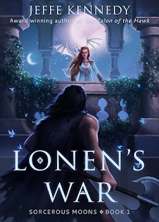
Now, I'm not saying that the cover CAN'T reflect the story, but a book cover has two jobs:

  1. Catch the reader's eye in a pleasing, enticing way.
  2. Convey genre or some sense of what kind of story it will be.


That's it. Simple, but also very difficult. That's plenty of work for an image and a few words to do. Those jobs don't need to be further complicated by putting the author's story-vision into an image. In fact, when authors try to insert that vision, they can get in the way of the primary two functions of the cover.

So, I know it's hard. I have been there and I have had covers I hated, where the characters looked NOTHING like what I had in my head. I have had covers I loved that did nothing to sell the story inside. I've had horrible covers that I'm convinced tanked sales. I've had covers that readers rhapsodized over for no reason that made sense to me. When I work with my cover designer on the covers of my indie books, I really have to take off my author hat and put on the publisher one - and remind myself of the two rules. Tough love for myself, too!

Wednesday, January 18, 2023

Handling Negative Reviews with Poise and Humor

Here's a little tease of the cover of ROGUE FAMILIAR, book 2 in Renegades of Magic, releasing at the end of February. Cover reveal coming soon!

This week at the SFF Seven we're talking about the Mentality of Negative Reviews. Specifically, the person who posed the question asked: do you recognize your fight-or-flight response to negative reviews and do anything to stop it?

I'm including the full text of the question because I'm disagreeing with the initial premise. I don't think I have a stress response to negative reviews. It could be that I've been writing long enough (nearly thirty years *gasp*) that I've become more or less inured to negative reviews. I remember a review of my first book, the essay collection WYOMING TRUCKS, TRUE LOVE, AND THE WEATHER CHANNEL, that was mostly glowing - but also said I used adverbs too much. It came from a professional reviewer at a venue I can't recall, and that was long before I realized that many reviewers are aspiring writers who cling to the "rules" of writing with the tenacity of an apprentice seeking the magic formula to catapult them to true wizard status. Mostly I was surprised that, if my professional, experienced editor at a university press hadn't minded my adverbs, then why did a reviewer? I understand now. I also know more about the weird anti-adverb stance some writers absorb.

Mostly. <- See what I did there? Humor is key.

Anyway. Experiencing a flight-or-fight response to a review means that you feel attacked. I suppose some reviewers intend it that way. They like to speculate about the author's emotional life, intentions, or deadline pressure. Authors are occasionally accused of manipulating readers to extract profit. Sometimes our moral integrity is questioned. But that's all par for the course on social media. I think what's most important for writers to do is separate themselves from their work. YOU didn't receive a negative review; the book did. Even if the reviewer specifically attacks the author, they're still not actually reviewing you as a human being, because they don't actually know you. The author is a construct in their mind that has very little to do with reality. 

Keeping your poise, a sense of yourself as a person separate from the work, and keeping a sense of humor about it all is what gets you through. After all, a review isn't a tiger. No one's going to die over a review. It's fangless, toothless, and ultimately dust in the wind.


Friday, March 11, 2022

Covering All That

Book covers are as much art as they are science and I mean that beyond the images. It's an art I'm not that good at. For that reason, I engage people who know more about book covers than I do - particularly people who know what questions to ask to elicit the most helpful (some might say most marketable) aspects of the story. Jeffe mentioned that the point of the cover is to catch the eye and to convey genre as quickly and completely as possible. If you can work story images into whatever ends up on that cover? Bonus. But more than once I've had to have a cover artist talk me down from the tree where I insist that some image from the plot needs to go on the cover. I never insist on having my way on covers - I hire professionals and then I listen to them. It's their livelihood. They know better than i what the trends are - but honestly, chasing trends is a fool's mission - the real issue is that the cover artists I hire have the experience to understand what a reader expects to see in a cover for a science fiction romance novel. Or an urban fantasy novel.

When I finally finish the SFR series, I'll have an opportunity to cover the books. I won't bother with trends. I will do my darnedest to make sure the covers for the two new books look as much like the previous three covers as possible. My goal will be to keep the branding visually similar. I want people to be able to look these books up on whichever online story they prefer and know just by looking that these stories belong together.


If I had the mental bandwidth to put a new cover on the incubus book, Damned if He Does, I'd work hard to get rid of ambiguous symbolism on the cover. Right now, the existing cover does a fine job of conveying that the story is a romance. But the cover includes all those flames. Lots of them. There's a plot reason for that - the incubus is in thrall to Satan and Hell. Unfortunately, in a romance cover, flames can also mean that the story is hot - erotic. In the case of this book, it was supposed to convey those fires of Hell. You can see how that image on the cover could be confusing. I'm concerned that readers might pick it up thinking it's a sexy read when it isn't. The heroine is Ace. The smexy just isn't as hot and heavy as those darned flames might mistakenly convey. In a perfect world, I'd have the bandwidth to update the cover. I just don't at the moment.

Book covers can be a great asset to a book and across the publishing world, you'll find all kinds of check lists and points to consider as you work on building a visual package to represent your story. They're worth glancing at. It's always worth glancing at what other authors in your genre are doing with covers as you think about yours. But it pays to remember that the cover has one job - get someone to crack open your story. That's it. And yes. It's a lot to ask of a static image. Buy maybe that awareness can help you take a step back. Sure. We all want our covers to be perfect. We worked so hard on the story, we want it dressed to the nines, dang it. Just consider what kind of audience you're going to attract if you dress your book like Wednesday Adams versus dressing it like a Kardashian or like Annie Oakley or like Madam Curie. Very different looks. Very different moods. Very different audiences. It's one of the tricks a cover artist taught me. Pan out a little. Consider the voice of the story. Then match the feel of the cover to that voice if you can.

That's the piece I'll add to Jeffe's advice of focusing on eye catching and genre. Figure out the voice of the story and lean into it in the cover.

Wednesday, March 9, 2022

When It's Time to Put New Covers on a Series

This week at the SFF Seven we're discussing Cover Trends. We're asking "What was, is, and will be "hot" in cover art/style for your sub-genre? If you have a say in your covers, will you chase the trend or will you stick with the image in your mind?"

There's a lot to be said on this topic, too much for even a week of blog posts. When I'm asked for advice on covers, which is a frequent request, I tell authors to keep in mind that a cover has two jobs: to attract positive attention and convey genre. This has to be emphasized because authors - both in trad and in self-publishing - tend to get caught up in wanting the cover to adhere to the story. One first-time author who was very upset with the cover her publisher gave her and came to me for advice said "but the cover doesn't illuminate the story." I had to tell her that the story's job is to illuminate the story. The cover does different work: attract the eye and convey genre.

It's that second that's most relevant for this week's discussion. Because trends change and a cover that accurately conveyed genre six years ago may find itself conveying something else entirely to a current audience. 

Case in point: I love the covers for my six-book Sorcerous Moons series

These were among the first book covers I ever commissioned and I particularly adore the cover for book one, LONEN'S WAR. It does come straight from a scene in the book - a pivotal scene that was, in part, the genesis image for the story - and the artist (Louisa Gallie) exactly nailed what I had in mind.

I will always be grateful for Louisa's gorgeous art and I will always love this cover.

But, recently, people have been pointing out that these covers no longer convey what kind of story these books tell. The fantasy romance genre has moved on. If I want to tell readers that this IS the kind of thing they're looking for, then I should consider updating to match current trends. 

So I did!

Behold: The new cover for LONEN'S WAR

I contracted with BZN Studio Designs to design new covers for all six books. Right now the series isn't available, but once I have all six covers, I'll re-launch the series with some fanfare. I'm super excited to see how they do with the new covers. I've heard some people (including my own assistant!) say scathingly that these look like all the other covers out there in this subgenre, and there's truth to that. 

AND THAT'S THE POINT.

The content is what makes the stories unique. The covers are doing the job they're supposed to do. Caught your eye, did it? I hope so! And I'm hoping you also know exactly what kind of story you'll get. 


Sunday, March 6, 2022

The Art of the Book Cover

Hey all! This week's topic here at the SFF Seven is Cover Trends: What was, is, and will be 'hot' in cover art/style for your sub-genre? If you have a say in your covers, will you chase the trend or will you stick with the image in your mind?

I write romantic fantasy, and best I can tell, most books in my sub-genre have aimed toward symbol and typography covers over the last few years. Black and gold are popular too, but then other covers go for bolder colors. Here are a few examples:


I have noticed, however, that some covers in romantic fantasy that contain more of a fairytale vibe are leaning toward these artsy, folkloric covers.


Luckily for me, I only have the Witch Walker trilogy to deal with for now, and those covers have been completed since 2020. I also had input, which I appreciated from my publisher. This happened because they thankfully trust my judgment and knew I had a vision for this trilogy. I made mock-ups, sent them to the publisher who then sent them to the cover designer, and here we are. I think they're really beautiful, and I cannot wait to see them side by side in hardback!

As for where I see trends going? I don't really know. Any book that's popular enough can sway the market. If you look at Atlas Six, a dark academia/romantic fantasy TikTok sensation that went trad recently, you'll see a very minimal and mystical vibe with a mostly black cover. But then if you take a peek at Daughter of the Moon Goddess, a fairytale romantic fantasy, you'll see all this gorgeous pastel artwork that is just breathtaking. I love them both!!

I don't have my thumb on the cover-trend pulse, but I know a good cover when I see one ;)

What about you? What covers do you love in the romantic fantasy genre?


Saturday, August 7, 2021

The Witch Collector #Bookstagram

Man, I almost missed today's post! I've been under the weather and writing, so my mind isn't on point. And I would've hated to have missed today because I love love love Bookstagram! I'm a photography fanatic and have even done headshots, graduation pics, and engagement photos for various people. Graphics are a fun pastime for me, and having a book coming out soon that I can showcase makes that hobby even better. 

If you follow me on Instagram, all those graphics you see are made by me, unless I share a Bookstagram photo created by someone else. Canva is my go-to for this, although I've also used Bookbrush. There are all sorts of ways to do your own mock-ups and flat lays--free. For instance, this is just a Canva stock photo with my book image on top. I used a shadowing effect to give it a more 'real' appearance since I don't have paperbacks yet.


Here are a few more I made on Canva:


**For an easy, free book mockup tool, check this out. This is how I made the paperback image above. Below, I used the digital cover + shadowing again.


Even cooler?? When other people Bookstagram your book!


I have mad respect for Bookstagrammers. Just trying to curate my own little baby Insta is a grand task. I can't imagine the time and work they put into some of their images. I mean, hello, @myfriendsarefiction built a BOOK THRONE for The Witch Collector. That's WILD. I still can't get over it. And there will be more images to come in September from various book bloggers on Insta. We won't even talk about BookTok yet. I'm struggling in that department. One social media platform conquer party at a time ;)

Do you have a favorite bookish Insta account??


XOXO,


Saturday, February 15, 2020

Salute to My Cover Artist Fiona Jayde

Our theme this week is a shout out to the non-author creatives we collaborate with, or who enrich our lives. I'm going to keep my focus on the author sphere of my life and mention the wonderful Fiona Jayde.

She's always done my scifi romance covers and in the last year or so has also given me my fantasy covers and new Egyptian paranormal covers. Getting my new cover from her is a treat for myself, an encouragement to keep working on the book in question and FUN!

I highly value her professional opinion on the various genres and what's in, what's out, as well as her creativity...and her patience! I'm not a patient person but I admire the quality in others. Fiona has always been so patient with me when I pick stock photos that totally don't work (Me: "This one is great if we could airbrush out these three things, change the background, add a supernova and give her red hair..." Fiona: O_o, followed by a patient explanation of why we can't do any of that to the photo in question, followed by specific suggestions to achieve what I'm going for in a different manner, or alternate stock photos or...)

I think Fiona is really REALLY good at capturing the 'flavor' of the book in question from just my few notes and any inspiration photos I may send along.

I'll always remember the thrill of getting my first cover from her, for my first scifi romance to be published,Wreck of the Nebula Dream ("Titanic in space..." as one reviewer called it). That cover established what was to become my 'look' or brand for the books set in this universe.

My first REALLY huge seller was Star Cruise: Marooned and I've always thought the fabulous eye catching cover from Fiona was a key factor in getting readers to give the book a second look and maybe even a third one.

When it was time to start my Badari Warriors scifi romance series, she developed the series branding, with the ominous alien lab in the background and the sexy genetically engineered soldier in the foreground. Here's the entire series (including one we did under the In the Stars Romance logo, which frankly doesn't work as well for a book in a series.  Sigh. I confused everyone by writing that book outside the series! Never again! It's a perfectly fine logo for books written for that imprint and I might just be writing a few more for them....but not Badari Warriors.)
For my fledgling fantasy series, I asked her to have fun and sort of surprise me. Usually when we're doing the SFR I've at least tried to select the cover model or models and sent her anywhere from 3-10 possibilities. (I'm still not too good at not falling in love with photos that just don't work for a romance cover.) But I had no idea where to begin in fantasy romance.

I'm very happy with my two sparkly fantasy covers (and I have a third one already, for the next book, which I just have to write LOL.)
My original ancient Egyptian covers were mostly done by the amazing Frauke Spanuth of Croco Designs. I love her work and she did my first ever published book cover, for Priestess of the Nile, which I believe I may have cried when I saw it - so perfect.  But when the rights for the first book reverted to me, Harlequin kept the rights to the cover art.

Fiona and I had been working toward that day by designing a 'brand' image for these paranormals going forward.  Here's are the three recent covers she's created for me in the loosely connected series:

I have 38 books published, so it's tempting to give you all 38 pieces of eye candy but I'll restrain myself. (Book #39 coming soon...)

For more about Fiona and her services you can visit https://fionajaydemedia.com/

Note: Background graphics behind the multiple cover displays are from DepositPhoto

Sunday, February 9, 2020

Ravven: Queen of the Cover Artists

Our assignment this week at the SFF Seven is to give a shout-out to the non-author creatives who enrich our lives: illustrators, musicians, jewelers, painters, poets, voice-actors, etc.

This one is an easy pick for me because I just released THE FATE OF THE TALA, which means I've been posting the cover everywhere.

Fortunately, it's so freaking gorgeous that no one gets tired of seeing it over and over. That's because it's the work of Ravven, Queen of the Cover Artists


THE ARROWS OF THE HEART


Ravven and I have been working together for several years now, and every cover she's done for me has been amazing.


THE SNOWS OF WINDROVEN


I can't say enough about her. Not only does she create stunning images, she does such an incredible job of nailing my characters that I end up using the covers for inspiration as I write the stories.

THE SHIFT OF THE TIDE


Ravven is also a consummate professional, always responsive and delivering right on schedule.


SEASONS OF SORCERY


She's super fun to work with, and often comes up with visual elements that I incorporate into the stories because they're so perfectly congruent.


THE DRAGONS OF SUMMER


Ravven creates covers to order, and she also has an amazing set of premade covers she can customize for you. So check out her website! But I get first dibs on her schedule ;-)


Also, as a super fun thing with the release of  THE FATE OF THE TALA - if you subscribe to Pikko's House Book Lovers Box this month, a limited number of subscribers will get the first book that started it all, THE MARK OF THE TALA, for free!!


THE FATE OF THE TALA, the  exciting conclusion of the story begun in The Mark of the Tala!

An Uneasy Marriage,
An Unholy Alliance.

The tales tell of three sisters, daughters of the high king. The eldest, a valiant warrior-woman, conquered her inner demons to become the high queen. The youngest, and most beautiful outlived her Prince Charming and found a strength beyond surface loveliness.

And the other one, Andi? The introverted, awkward middle princess is now the Sorceress Queen Andromeda—and she stands at the precipice of a devastating war.

As the undead powers of Deyrr gather their forces, their High Priestess focuses on Andi, undermining her at every turn. At the magical barrier that protects the Thirteen Kingdoms from annihilation, the massive Dasnarian navy assembles, ready to pounce the moment Andi’s strength fails. And, though her sisters and friends gather around her, Andi finds that her husband, Rayfe, plagued with fears over her pregnancy, has withdrawn, growing ever more distant.

Fighting battles on too many fronts, Andi can’t afford to weaken, as she’s all that stands between all that’s good in the world and purest evil.

For Andi, the time to grow into her true power has come. . .


Saturday, December 28, 2019

My List of Top 10 Impactful #SciFi Romance Covers of 2019


There are two parts to this post – first, when I started thinking about doing a post on the most memorable-to-me science fiction romance covers I’d seen in 2019, I took my pen in hand and wrote down the ten which came immediately to mind. I see something like 3000+ covers a year (in 3 genres) while doing my weekly new releases column so if a cover stays on my mind that’s really impactful!

Please read on below the Top 10 for Part Two and my Honorable Mention covers!

(Drum roll please.....) 
THE TOP 10 IMPACTFUL COVERS!


Moving on to Part Two, I see well in excess of 600 science fiction romance covers a year while doing the report. This weekend I scrolled through every single SFR cover which made it to the blog in 2019 and ended up with 40 which caught my attention above and beyond the others. So about 8% (all numbers approximate). Obviously the ten I listed in Part One of this discussion are added to the 40 for a total of 50 (or about 8%) for 2019.

Before anyone rushes to apply my purely informal and highly personal results to their next book marketing campaign, I’m not any kind of an art or graphic composition expert! And there are giant trends in SFR such as the sexy manchest and abs, which I myself happily use on my Badari Warriors novels, and very much appreciate. I found that while looking at the 600+ covers for this exercise, most of those didn’t stand out to me as much as some others did when seen in a vast grouping of similiar images. They surely do catch my eye from week to week.  

I obviously am drawn to certain color palettes too…but who knows if I’m a typical reader?

On the weekly new releases posts, I include all the covers in the post itself (unless I really find a cover objectionable or too disturbing, or it's not remotely PG-13+, with total nudity for example) but I feature 8 covers each time in the social media promo for the post, including one that’s my highlighted image. I strive for variety there. In the spotlight of 8 images weekly, I try to mix professional-looking covers featuring individuals/couples/aliens/pleasing compositions/differing color palettes…I lean toward the covers which I feel will catch the eye of a potential reader as they browse through their streaming social media. My selection criteria on featured covers for the weekly promo are slightly different than the criteria I used for this massive end-of-the-year exercise.

So when I assessed my results on memorable covers of 2019, what did I find attracted me? What made me linger as I slowly scrolled my way through the list alphabetically by title? Sometimes it was the stock photo model’s face, or their eyes (I’m a sucker for piercing/soulful/gorgeous eyes) or the color palette or the ”scifi-ness” of the cover, or the couple together or just the power of the image overall. (I have to say for Tasha Black’s Tolstoy cover up above in the Top 10 it’s the sheer, infectious happiness of the man and the baby. For Lula Monk’s Dredge in the Honorable Mentions, it’s the unsettling power of the image. I find it hard to forget that one, very effective in its own way!)

Without further ado, here are the rest of the approximately top 8% of the hundreds of SFR covers I saw in 2019 which made me pause this weekend and take a longer look. Covers provided in no certain order!


And my thanks to all the wonderfully talented cover artists - if I knew all the names I would certainly share them here! Kudos to the authors who can do their own and make them outstanding. Feel free to add the artists' names in the comments if you so desire. 
Fiona Jayde does all of my covers, by the way and I loooove them.
Looking forward to savoring more beautiful, awe inspiring, sexy scifi romance covers in 2020!


Friday, August 31, 2018

Cover Artist Praise


 Danielle Fine does most of my covers. It's a good thing, too, because on those forms for authors, when cover artists ask if you have a vision for the cover, I always do.

And it pretty much sucks. 

For Damned If He Does, I'd figured on some artsy cover because the hero is a frustrated artist. And maybe because I grew up with those kinds of covers out of the 70s and early 80s with geometric shapes in once bold colors that inevitably faded by about the third year the book had been on a shelf. 

Danielle kindly led me down the path of PNR reader expectations for this cover. And even if the cover seems to promise something the book doesn't deliver (I had concerns this cover conveyed a really hot read and well - the heroine is ace so while the story has its share of flames, they aren't the sexy kind, much) this book is already one readers either love or think should have been a short story. So eh. Point of interest. Danielle found the models for the cover and she NAILED that heroine.

She found the heroine image for Emissary, too. After I'd looked and looked and looked. This heroine isn't 20. She's at the end of her soldiering career and I really wanted someone who looked like she hadn't just skipped class at the local high school. 

I think my favorite thing about Danielle's work is that whether models match my particular internal vision or not, Danielle always manages to convey the mood of the story. Every single time.


The two Nightmare Ink covers were done by someone at Berkley - I'm ashamed to say I don't know by whom. Because both books are e-only, the covers are simpler and with the first book, the editor and marketing staff chose to go against the UF tide at the time. Most UF covers at the time these came out were barely clad heroines in ripped jeans and leather. Some gorgeous covers came out of that, but Isa wasn't that kind of bad ass heroine. She has her strengths, but fighting isn't one of them. At least, not physically. The only issue we had with the covers, in my opinion, was that the first book didn't actually convey any hint of magic. I think the Bound By Ink cover does a better job of that. It's more atmospheric, too. But this is the difference between publishing through a traditional publisher and publishing your own work. With a traditional publisher, covers are collaborative to a point. Past that point, you can't ask for further changes in the cover. On books you publish yourself, you can pursue THE perfect cover to the limits of your budget. I have a dream to be able to commission original artwork for book covers. Just because I love painterly covers and if I could pay an artist whose work I love - everyone wins.