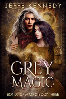
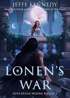
Book covers are as much art as they are science and I mean that beyond the images. It's an art I'm not that good at. For that reason, I engage people who know more about book covers than I do - particularly people who know what questions to ask to elicit the most helpful (some might say most marketable) aspects of the story. Jeffe mentioned that the point of the cover is to catch the eye and to convey genre as quickly and completely as possible. If you can work story images into whatever ends up on that cover? Bonus. But more than once I've had to have a cover artist talk me down from the tree where I insist that some image from the plot needs to go on the cover. I never insist on having my way on covers - I hire professionals and then I listen to them. It's their livelihood. They know better than i what the trends are - but honestly, chasing trends is a fool's mission - the real issue is that the cover artists I hire have the experience to understand what a reader expects to see in a cover for a science fiction romance novel. Or an urban fantasy novel.
When I finally finish the SFR series, I'll have an opportunity to cover the books. I won't bother with trends. I will do my darnedest to make sure the covers for the two new books look as much like the previous three covers as possible. My goal will be to keep the branding visually similar. I want people to be able to look these books up on whichever online story they prefer and know just by looking that these stories belong together.

If I had the mental bandwidth to put a new cover on the incubus book, Damned if He Does, I'd work hard to get rid of ambiguous symbolism on the cover. Right now, the existing cover does a fine job of conveying that the story is a romance. But the cover includes all those flames. Lots of them. There's a plot reason for that - the incubus is in thrall to Satan and Hell. Unfortunately, in a romance cover, flames can also mean that the story is hot - erotic. In the case of this book, it was supposed to convey those fires of Hell. You can see how that image on the cover could be confusing. I'm concerned that readers might pick it up thinking it's a sexy read when it isn't. The heroine is Ace. The smexy just isn't as hot and heavy as those darned flames might mistakenly convey. In a perfect world, I'd have the bandwidth to update the cover. I just don't at the moment.
Book covers can be a great asset to a book and across the publishing world, you'll find all kinds of check lists and points to consider as you work on building a visual package to represent your story. They're worth glancing at. It's always worth glancing at what other authors in your genre are doing with covers as you think about yours. But it pays to remember that the cover has one job - get someone to crack open your story. That's it. And yes. It's a lot to ask of a static image. Buy maybe that awareness can help you take a step back. Sure. We all want our covers to be perfect. We worked so hard on the story, we want it dressed to the nines, dang it. Just consider what kind of audience you're going to attract if you dress your book like Wednesday Adams versus dressing it like a Kardashian or like Annie Oakley or like Madam Curie. Very different looks. Very different moods. Very different audiences. It's one of the tricks a cover artist taught me. Pan out a little. Consider the voice of the story. Then match the feel of the cover to that voice if you can.
That's the piece I'll add to Jeffe's advice of focusing on eye catching and genre. Figure out the voice of the story and lean into it in the cover.


